
How to Create Interactive Charts from Excel Data – Five Minute Python Scripts python tricks from Techmirrors
Plotly is a great tool we can use to create many types of interactive charts from pandas df’s and microsoft excel spreadsheets.
What we’ll cover:
– How to download Pandas, plotly
– How to load data into pandas dataframe
– How to format that data for loading into a plotly figure
– How to display that plotly figure
– How to save the figure once created
Thanks so much for all the support! You guys are incredible. We BROKE 4,000! 4,090+ subscribers. You all rock. Thanks for supporting me.
*****************************************************************
Full code from the video:
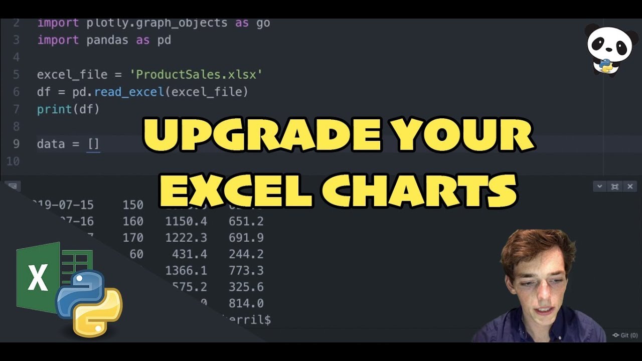
import plotly
import plotly.graph_objects as go
import pandas as pd
excel_file = ‘ProductSales.xlsx’
df = pd.read_excel(excel_file)
print(df)
data = [go.Scatter( x=df[‘Date’], y=df[‘Profit’])]
fig = go.Figure(data)
fig.show()
plotly.offline.plot(fig, filename=”Salesreport.html”)
https://github.com/Derrick-Sherrill/DerrickSherrill.com/blob/master/sales_graph.py
*****************************************************************
Code from this tutorial and all my others can be found on my GitHub:
https://github.com/Derrick-Sherrill/DerrickSherrill.com
Check out my website:
https://www.derricksherrill.com/
If you liked the video – please hit the like button. It means more than you know. Thanks for watching and thank you for all your support!!
Always looking for suggestions on what video to make next — leave me a comment with your project! Happy Coding!
sourceTechmirrors